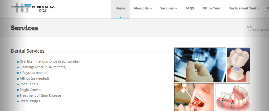
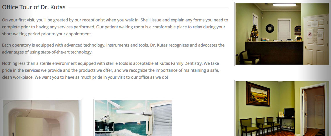
The story was... can you please make it responsive. I said... sure! The first website, was not responsive, or did not fit, on all devices. The site has basic information, services, staff photos, FAQs, and all contact information. They wanted a website that was clean, modern User Interface (UI) and for the customers to have a great user experience.

I began the design process with multiple wireframes and prototypes (including wireframes for mobile). Then I designed two different templates, but I could not have accomplished this without wireframes. The wireframes outline the flow or the structure of the entire website. The ["complete website or app"] solution must start with 'Think-Mobile-First.' The wireframes give an important visual for the team, the managers and stake holders to see how the page or section would look, then the prototypes are designed. Just like a mold or mouth-piece for your teeth, a mold is made first. Then it is fitted to your mouth. (How can you design a prototype without a sketch or wireframe first.) How would this site look on a SmartPhone or Tablet. (Why is mobile so important, because 52% of website traffic is on mobile.) Clickable prototypes (HTML5 & CSS3) were approved. Dr. Kutas and his staff were very pleased. His customers said, I'm glad I can use your site on my phone... I really like it.