

Warm/ Rich Colors (PRIMARY)— Usage of orange colors could be used for construction or education thus bringing enthusiasm.
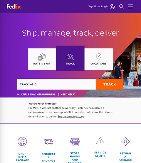
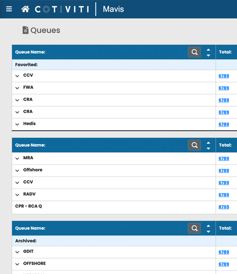
Cool/ Independent Colors (SECONDARY)— Usage of blue colors could be used for healthcare, transportation or technology thus portraying trust and stability.
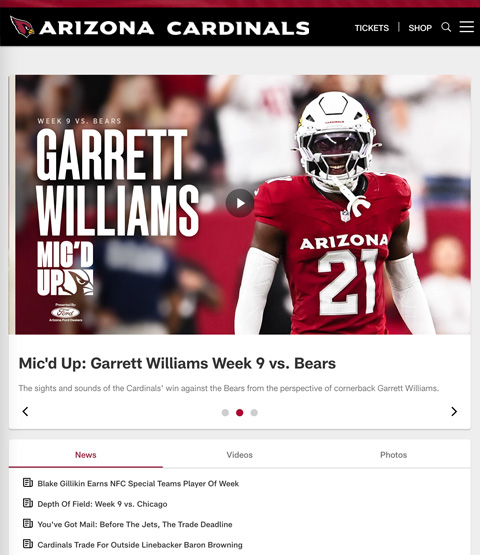
Vibrant Pink and Red Colors— Usage of pinks could be used for beauty or feminine brands or reds for sports, entertainment or news thus portraying strength and power.
Earthy Green, Purple and Yellow Colors— Usage of green colors could represent natural/ organic products/services or success. And Purple could be used for hospitality or non-profits, or finance industry thus portraying sophistication or adaptability. Yellows could project energy, cleanliness or youth for cleaning products or youth centers or gyms or energy companies.







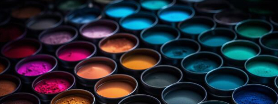
Tertiary Colors— are colors made by combining a secondary color with a primary color. There are six tertiary colors. (They are yellow-ish orange, red-ish orange, red-ish purple, yellow-ish green, blue-ish green and blue-ish purple.)
Complementary Colors— Two colors that are on opposite sides of the color wheel. This combination provides a high contrast and high impact color combination – together, these colors will appear brighter and more prominent. The bottom line is for example, if your call-to-action button [Save] is blue or blue background, then white text is a good choice because of high contrast. (The adjacent button may say "Cancel" or "Edit" and that button might have white background with blue stroke or border and blue text.)

Accessibility in UI Color Palettes— Creating an attractive UI color scheme for your design is one part of the challenge. Ensuring its accessibility for all users is of significant importance. The color choices ensure that your digital platforms are usable and enjoyable for "most" everyone. Avoid using [Red and Green]: About 5% of people have difficulty distinguishing between these colors. *Note careful use of Red and Black: People who are unable to detect [red] may confuse the two colors.
The 60-30-10 Rule—
- 60% of your space should be covered with the primary color.
- 30% with the secondary or supportive color.
- 10% with an accent or guiding color.
For any interface is tried/true dark grey for your TEXT (better readability). Use contrast in call-to-action buttons (please be clever and not say CLICK HERE) - - Give your button a descriptive name. And for your branding style guide stick to or use 3 colors for your palette. (Example: blue, light blue and dark grey.)
Example choosing color for Software / Website / App—
- Text Color: choose dark grey text.
- Header Text: for articles and the (subhead text).
- Button Colors: choose primary button color i.e. dark teal or blue and the secondary button color. And choose color for breadcrumb links.
- Background Color: choose your background color carefully. It is not always white, howver make sure there is enough contrast for the text color so there is no issue for readability or legibility, for the internal or external users. *Choose color wisely.
Helpful Color Wheel - (Canva)
